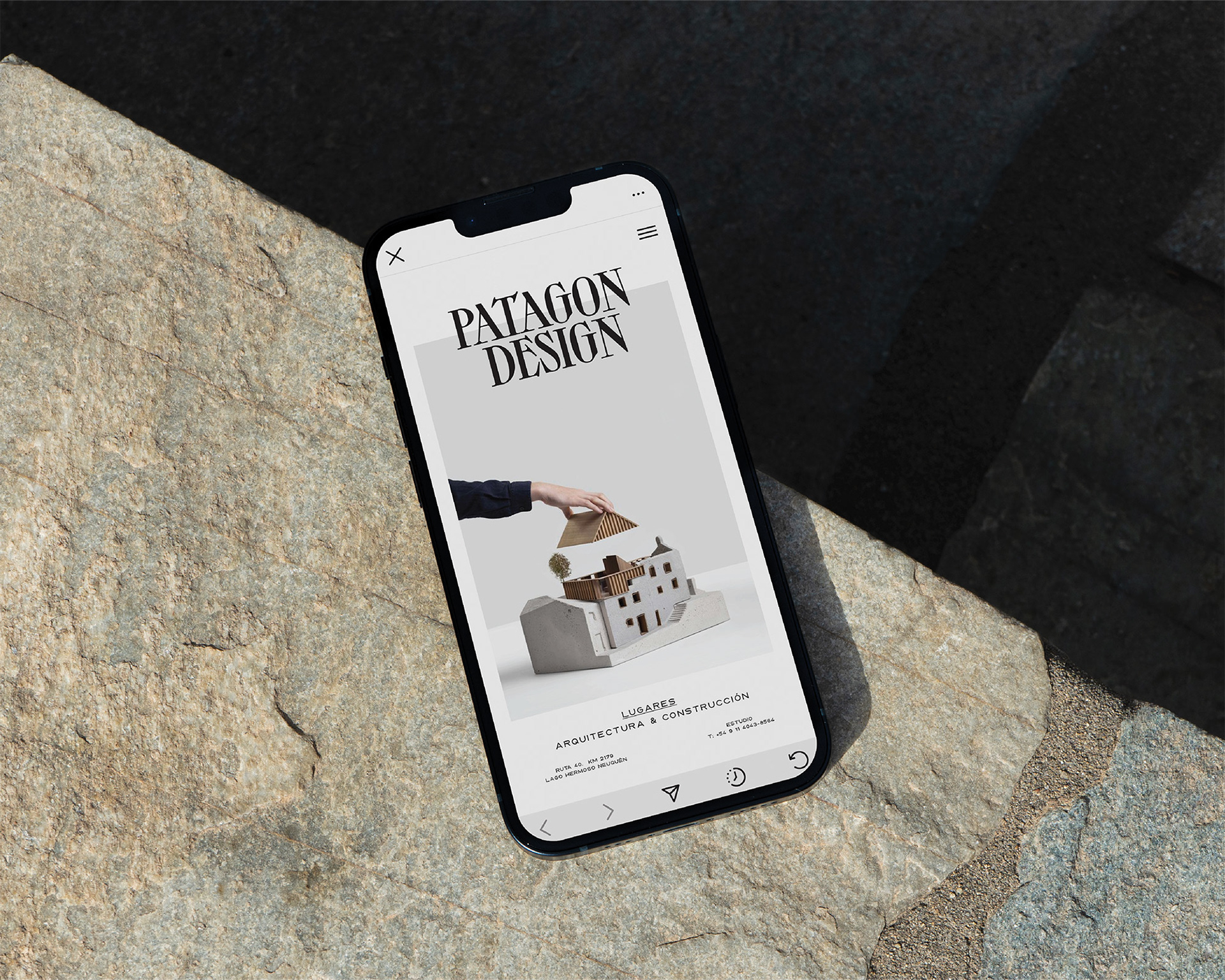
PATAGON DESIGN – Patagonia, Argentina
Bringing AI-driven efficiency to real estate and architecture in extreme environments.
Challenge
Patagon Design, a real estate and architecture studio operating in Patagonia, faced a unique challenge—harsh weather conditions often delayed construction timelines, affecting project efficiency and client expectations. The business needed a scalable system to automate workflows, streamline communication, and improve planning reliability while maintaining its strong visual identity that connected with Patagonia’s natural beauty.
Solution
To overcome these logistical challenges, we developed a two-part strategy: AI-Powered Business Automation & Brand Positioning.
1. AI-Powered Business Automation:
Implemented a custom AI-driven project management system that predicts weather-related delays and suggests alternative timelines.
Developed an automated client update system that provides real-time construction progress reports via ChatGPT-generated emails.
Integrated lead generation automation, using ChatGPT-driven content strategies to attract and educate potential buyers.
Built a scalable CRM pipeline, allowing seamless coordination between architects, suppliers, and clients, ensuring transparency and efficiency.
2. Brand Strategy & Positioning:
Redefined the brand identity to highlight the balance between modern architecture and Patagonia’s rugged landscape.
Designed a user-friendly, intuitive website that not only showcases past projects but also features an AI-powered home-buying guide, helping potential buyers navigate real estate investment in Patagonia.
Created visual storytelling elements—using high-quality photography and immersive drone footage to communicate the experience of living in Patagonia, not just the properties themselves.
Impact
Reduced project delays by 32% by integrating weather-based AI predictions into the workflow.
Boosted client engagement by 60% through automated email updates and interactive AI-driven content.
Increased lead conversion rates by 45%, with a more structured and engaging sales funnel.
Expanded brand recognition, positioning Patagon Design as a leader in high-end, sustainable architecture in extreme climates.
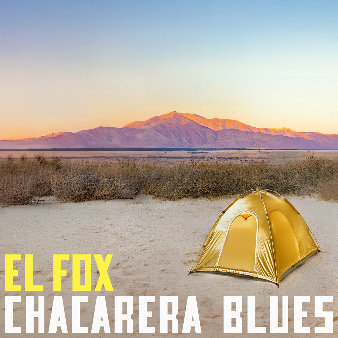
EL FOX – CHACARERA BLUES
A kingdom in the desert. A song born in solitude.
Brand Strategy & Positioning | Creative Direction & Design
Challenge
El Fox is not just a songwriter; he is a storyteller, a traveler, a wanderer shaping sound from silence. His music is rooted in chacarera and blues, a mix of folklore and rebellion, tradition and the unknown. The challenge was to visually capture this mythical essence—his creative world—without falling into cliché representations of folklore or desert landscapes.
How do you build a world around an artist?
How do you create an image that feels timeless, mystical, and personal?
How do you make the listener step into El Fox’s world before they even hear a note?
Solution
🔹 A Symbolic Kingdom – The Desert as a Metaphor
The golden tent represents solitude and creation—a sacred space where music is born.
The vast desert is his territory, his inspiration, his silence.
The mountains glow with the last light of the day, suggesting a sense of timelessness, of being on the edge of something vast and unknown.
🔹 Visual Identity – Myth & Mystery
Typography: Bold, slightly rugged, referencing old Westerns and vintage folklore posters.
Color Palette: Golden hues contrast with the blue infinite sky, symbolizing both warmth and distance.
Composition: A single golden tent in an open landscape—a mystery waiting to unfold, much like a song’s first note.
🔹 A Story Before the Song
The image serves as a portal into El Fox’s universe, making his identity larger than the song itself.
Marketing materials extend the narrative, reinforcing the concept of the artist as a traveler, a mythical figure creating in the wild.
A potential tagline: “Donde el zorro canta, el viento escucha.” (Where the fox sings, the wind listens.)
Impact
✔ A strong, immersive identity – The visual direction builds El Fox as an experience, not just an artist.
✔ A unique visual signature – The golden tent becomes a recognizable symbol of his world.
✔ A sense of mythology – It turns El Fox into a legend before the first note is played.
✔ A unique visual signature – The golden tent becomes a recognizable symbol of his world.
✔ A sense of mythology – It turns El Fox into a legend before the first note is played.
Final Thought
"Every legend begins in a place only one person knows."
With this creative direction, El Fox doesn’t just release a song—he invites the listener into his kingdom.
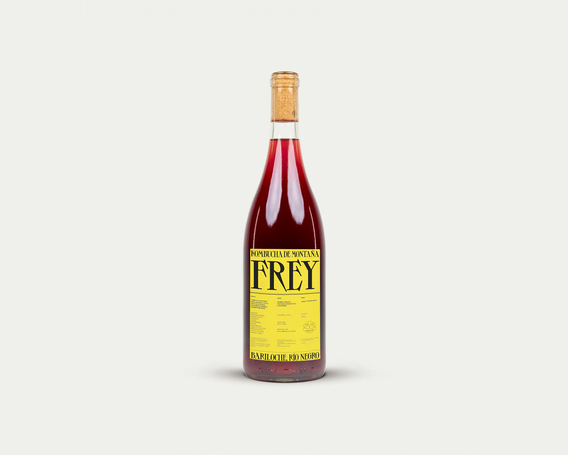
FREY – Kombucha de Montaña
A legacy of tradition, bottled for a new generation.
Brand Strategy & Positioning | Creative Direction & Design
Challenge
The family behind La Marmite, a traditional restaurant in Bariloche, wanted to extend their legacy into a contemporary product line—something that would resonate with a younger audience while staying true to their heritage of quality and craftsmanship.
They needed a brand identity for Frèy, a mountain kombucha that felt rooted in tradition yet fresh and modern.
How do you evolve a legacy brand without losing its soul?
How do you position kombucha—not just as a drink, but as an experience that reflects the landscape?
How do you attract a new audience while staying authentic?
Solution
🔹 A Name That Honors Place & Craft
"Frèy" pays homage to the rugged landscapes of Bariloche, where tradition and adventure meet.
The name carries history but feels modern, bold, and memorable.
🔹 Visual Identity – Classic Meets Contemporary
Typography: A strong, elegant serif that feels timeless, contrasted with a modern, clean layout.
Color Palette: A striking yellow label, standing out against the deep red kombucha—a visual signature that feels fresh yet sophisticated.
Minimalist Design: The label is direct, confident, and uncluttered, mirroring the purity of the drink itself.
🔹 Packaging as a Storytelling Device
A glass bottle with a natural cork, reinforcing the artisanal, small-batch quality.
The geographic location "Bariloche, Río Negro" is printed boldly, grounding the brand in a sense of place.
Impact
✔ Expanded Audience Reach – A product line that bridges tradition and modernity, attracting both loyal customers of La Marmite and a younger, health-conscious demographic.
✔ Instant Brand Recognition – The bold yellow label creates strong shelf presence and visual recall.
✔ Authenticity & Market Differentiation – Positioned as a locally crafted, high-quality kombucha that is both rooted in heritage and relevant to today's market.
✔ Instant Brand Recognition – The bold yellow label creates strong shelf presence and visual recall.
✔ Authenticity & Market Differentiation – Positioned as a locally crafted, high-quality kombucha that is both rooted in heritage and relevant to today's market.
Conclusion
Frèy is more than a drink—it’s a taste of Patagonia, a meeting of tradition and reinvention, a bridge between generations.
Simple. Bold. Timeless.
Simple. Bold. Timeless.
Máximo Bustillo & Co.
Instagram: maximo.bustillo
Linkedin: